


The Palette of Comfort: Choosing Color Schemes for a Warm and Welcoming Home
The colors that surround us in our homes do more than merely decorate—they shape our mood, influence our energy, and fundamentally define the atmosphere. Creating a sense of warmth and welcome relies less on following fleeting trends and more on understanding the timeless emotional language of color. This guide explores the principles and palettes for selecting truly温馨 (wēn xīn)-inspired color schemes for your household goods and decor.
The Foundation: Understanding Warmth in Color Theory
Warmth in design is evoked through hues that are inherently cozy, embracing, and gently stimulating. These are typically found on the red, orange, and yellow side of the color wheel. However, true sophistication and balance come from using these in combination with supportive neutrals.
Core Principles for a Warm Palette:
- Embrace Undertones: The secret to warmth lies in undertones. A beige with a pink or yellow undertone feels warm; one with a gray or blue undertone feels cool. Always compare swatches in your home's natural light.
- Prioritize Low Saturation: Muted, softened, or "dusty" versions of colors (think ochre instead of lemon yellow, terracotta instead of fire-engine red) feel more grounded and restful than their pure, bright counterparts.
- Layer in Texture: Color is experienced through texture. A warm gray linen throw, a creamy ceramic vase, and a walnut wood table in the same room create a rich, tactile warmth that flat color alone cannot achieve.
Signature Warm Color Schemes for Household Goods
Here are four versatile and deeply welcoming palettes to guide your choices for textiles, kitchenware, accessories, and more.
1. The Earthy Embrace
- Core Palette: Terracotta, Olive Green, Warm Sand, Cream.
- Why it Works: This palette directly connects the home to the natural world, evoking stability and comfort. It is inherently grounding.
- Application: Choose terracotta pots and linen napkins in olive or sand. Use cream-colored ceramic dinnerware as a base. Opt for wooden utensils with a warm oil finish. This scheme works beautifully for living rooms (upholstery, rugs) and kitchens.
2. The Softened Spice
- Core Palette: Mustard Yellow, Blush Pink, Muted Sage, Off-White.
- Why it Works: It combines the gentle cheer of yellow with the calming tenderness of pink, balanced by a soft green. It feels both optimistic and serene.
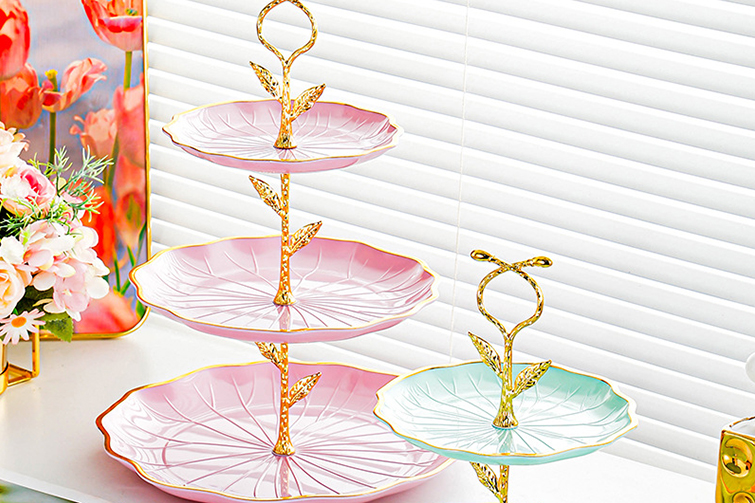
- Application: Perfect for bedding and bathroom textiles (towels, bath mats). A mustard velvet pillow or a blush throw blanket adds instant warmth. Look for glazed stoneware in these muted tones for a cohesive kitchen look.
3. The Neutral Sanctuary
- Core Palette: Warm Taupe, Oatmeal, Hazelnut, Ivory.
- Why it Works: This is the essence of understated, enveloping warmth. It creates a serene, cocoon-like atmosphere that is endlessly flexible and relaxing.
- Application: Ideal for large furniture, curtains, and rugs. Introduce depth through varied textures: a chunky knit oatmeal blanket, a nubby linen sofa in taupe, ivory sheer curtains. Tableware in stone or matte ceramic in these tones feels organic and comforting.
4. The Deepened Hearth
- Core Palette: Burnt Sienna, Navy, Amber, White.
- Why it Works: This palette offers a more dramatic, intimate warmth. The deep sienna and amber evoke firelight and dusk, while navy provides a sophisticated, stabilizing anchor.
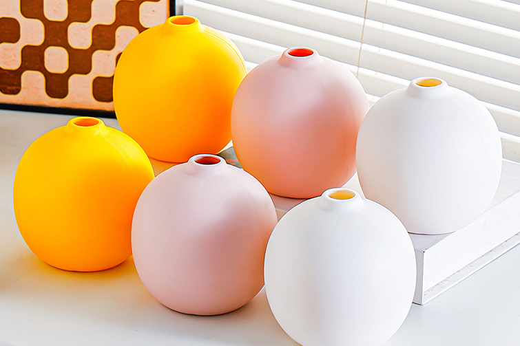
- Application: Excellent for creating cozy focus areas. Use for an accent wall, heavy cotton duvet covers, or dining table linens. Amber glassware or vases catch the light beautifully. Pair with brass or copper accents for a glowing effect.
Practical Guide: Applying Color to Household Categories
- Textiles (Bedding, Towels, Curtains, Rugs): These are your largest color investments. Choose your warm neutral (cream, oatmeal, warm gray) as a base for big items. Layer in your 2-3 accent colors from your chosen palette through smaller, changeable items like pillows, throws, and table runners.
- Kitchenware (Dinnerware, Utensils, Small Appliances): Cohesion is key. A set of cream or warm white dishes is universally flattering to food and flexible. Add warmth with wooden serving boards, a terracotta utensil crock, or a kettle in a muted spice tone. Avoid overly bright, cool-toned plastics.
- Furniture & Large Items: Stick to warm wood tones (oak, walnut, teak) or upholstery in your foundational neutral. You can be bolder with a single accent chair or a bookshelf in a deeper shade from your palette.
- Decorative Accessories (Vases, Art, Lighting): This is where your palette comes to life. Group objects in your chosen colors for impact. The warm glow of a salt lamp or dimmable amber bulb is irreplaceable for evening ambiance.
The Final Layer: Light and Life
- Lighting is Everything: Warm white bulbs (2700K-3000K) are non-negotiable. They cast a golden glow that makes every warm tone sing. Avoid cool, blue-toned daylight bulbs.
- Incorporate Life: The green of plants (like a fiddle leaf fig or pothos) complements every warm scheme, adding vitality and freshness.
- Personal Artifacts: The warm patina of family photos in wooden frames, well-loved books, or a woven basket contribute a narrative warmth that new items alone cannot provide.
Creating a warm home is an exercise in curated comfort. By selecting household goods within a considered, warm color palette, you build a visual and emotional harmony that turns a house into a sanctuary—a place that doesn’t just look inviting but truly feels it, offering rest and rejuvenation at the end of each day.